
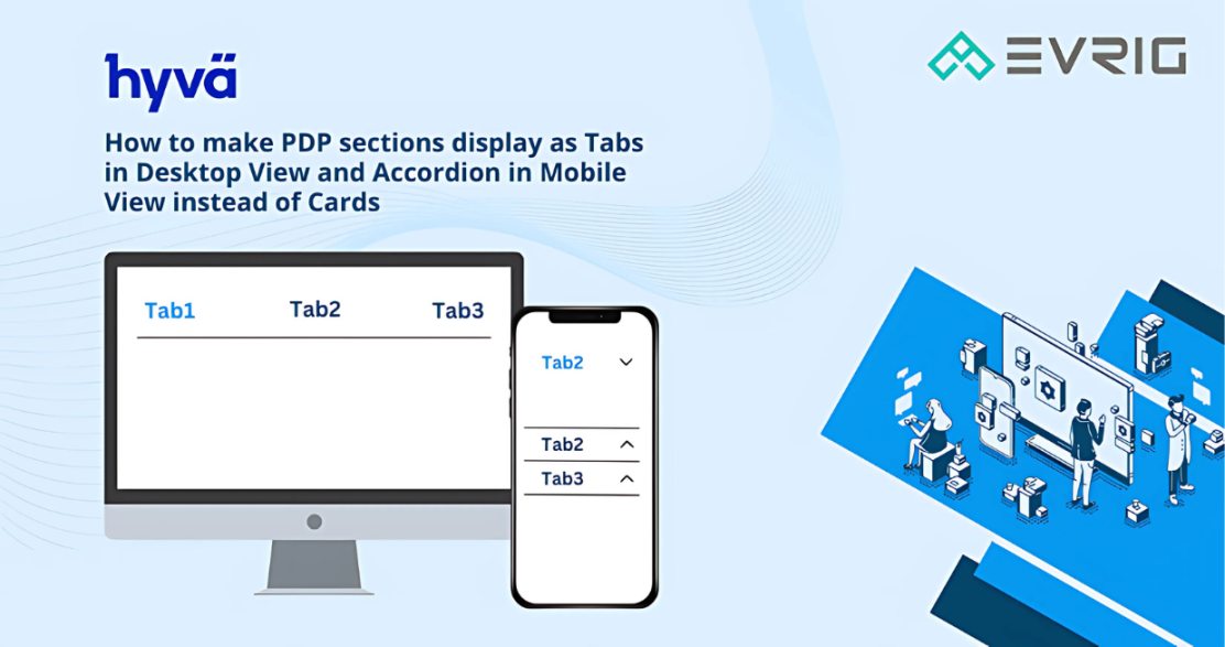
In this tutorial, Today We will explain How to make PDP Sections display as Tabs in Desktop View and Accordion in Mobile View instead of Cards.
Step 1: Add the Code
You just copy and paste the below code into your PHTML File, CMS block, or CMS Page.<div x-data="{ tab: 'tab1' }" id="tab_wrapper">
<div class="text-center border-gray-300 border-b hidden md:flex md:justify-center">
<div :class="{ 'text-red-800': tab === 'tab1' }" @click.prevent="tab = 'tab1'" class="text-xl mx-4 font-bold text-black cursor-pointer">TAB-1</div>
<div :class="{ 'text-red-800': tab === 'tab2' }" @click.prevent="tab = 'tab2'" class="text-xl mx-4 font-bold text-black cursor-pointer">TAB-2</div>
</div>
<div>
<div class="md:hidden text-xl font-bold cursor-pointer p-2 text-black bg-gray-100 border border-gray-300"
@click="tab = 'tab1'"
:class="{ 'active text-red-800': tab === 'tab1' }">
TAB-1
</div>
<div x-show="tab === 'tab1'" class="p-3">
<h2>TAB-1 Content</h2>
<p>This section can be used to display additional product information such as features, materials, specifications, or usage details. Customers can quickly access this information without leaving the product page.</p>
</div>
</div>
<div>
<div class="md:hidden text-xl font-bold cursor-pointer p-2 text-black bg-gray-100 border border-gray-300"
@click="tab = 'tab2'"
:class="{ 'active text-red-800': tab === 'tab2' }">
TAB-2
</div>
<div x-show="tab === 'tab2'" class="p-3">
<h2>TAB-2 Content</h2>
<p>Use additional tabs to organize important product details such as shipping information, care instructions, compatibility, or frequently asked questions. This keeps the PDP organized while making the content easy to access on both desktop and mobile devices.</p>
</div>
</div>
</div>
Step 2: Run the Commands
Run the below commands to see your changesbin/magento cache:clean
npm run build-prod
- The
bin/magento cache:cleancommand clears your Magento cache. - The
npm run build-prodcommand builds your Tailwind styles in the theme directory: app/design/frontend/Vendor/default/web/tailwind
Advantages of This Approach
- Achieve this without adding any external JS/CSS.
- Minimal use of Tailwind classes and Alpine.
- Customizable: You can change the design to meet your requirements.
- Mobile friendly: It will convert accordion in the mobile view.
- Responsive: This code adapts its layout to different screen sizes, ensuring your code looks great on all devices.
For a comprehensive walkthrough of this code and to explore various customization options, watch the video below.